Mobile & Tablet App Redesign for an EdTech Platform
Optimizing Content Discovery and User Flow for a Seamless Mobile Experience
PROJECT
Reimagining the user experience and streamlining key features for a seamless mobile and tablet solution.
ROLE
Led design, UX/UI, and project management independently, ensuring a seamless app redesign from concept to delivery.
Challenge
Redesign the app within a limited budget for research and under a strict timeline to meet a key education fair launch.
STRATEGY
Leveraged internal team insights, prioritized core features for the MVP, and implemented universal design best practices to enhance usability across devices.
OUTCOME
Launched successfully with positive feedback on search improvements and accessibility.
BricksLab is an EdTech platform that offers curated educational content for teachers and students.
Originally a web-based platform, BricksLab wanted to extend its reach with native mobile and tablet applications in time for a key educational fair. The goal was to deliver a polished, functional app that would showcase the platform’s value to educators and students in real-world classroom settings.
At the agency, I was the senior product designer responsible for translating the platform from web to mobile — not by simply copying and pasting but by rethinking and refining the experience to make it intuitive and effective on native platforms.
The challenge: we had a tight timeline and a limited budget for formal research.
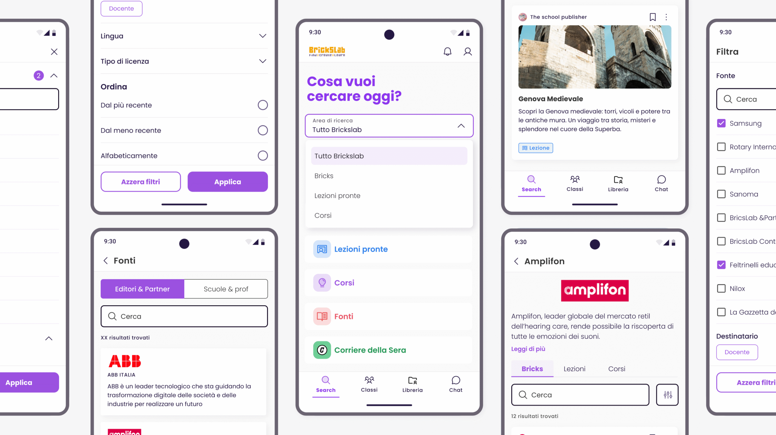
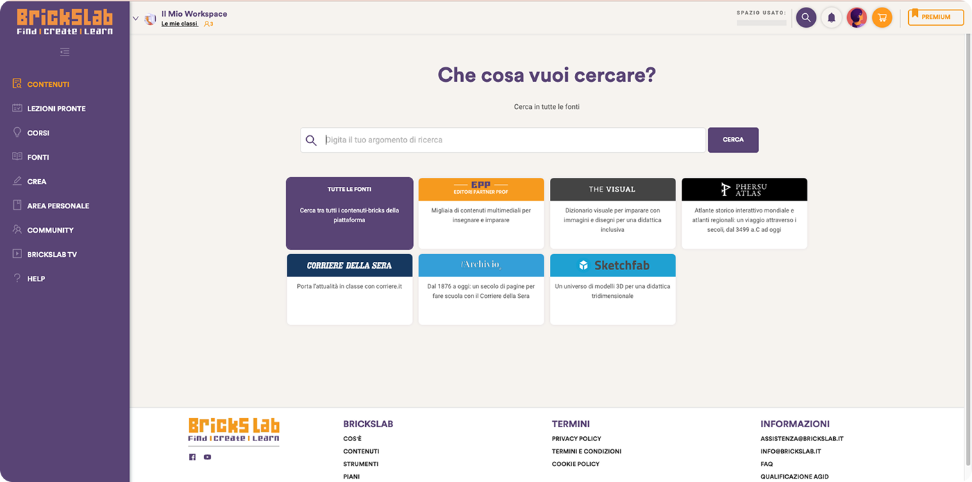
The starting point of the project, the search engine of the webapp
MY ROLE
Leading Design with Purpose
UX/UI lead for mobile and tablet
Conducted a comprehensive UX audit of the existing web app
Led feature prioritization for the MVP
Refined the visual identity and fixed inconsistencies in the design system
Enhanced accessibility throughout the design
Delivered high-fidelity prototypes and collaborated closely with the development team during implementation
CHALLENGE
Navigating Tight Constraints
The web app was feature-rich and tailored to desktop use, which made it cumbersome on mobile devices. Key challenges included:
Branding and visual inconsistencies: The app needed a more cohesive, scalable visual language, and a design system was essential.
Limited budget for research: We couldn’t afford user testing or formal research.
Tight deadline: The client wanted to launch the app in time for an education fair, which gave us limited time to design and implement the solution.
Complex navigation: The web app had dense menus, and core features (like search) were buried.
Despite these challenges, the project was an opportunity to reimagine the core user experience while making smart design decisions based on real-world constraints.
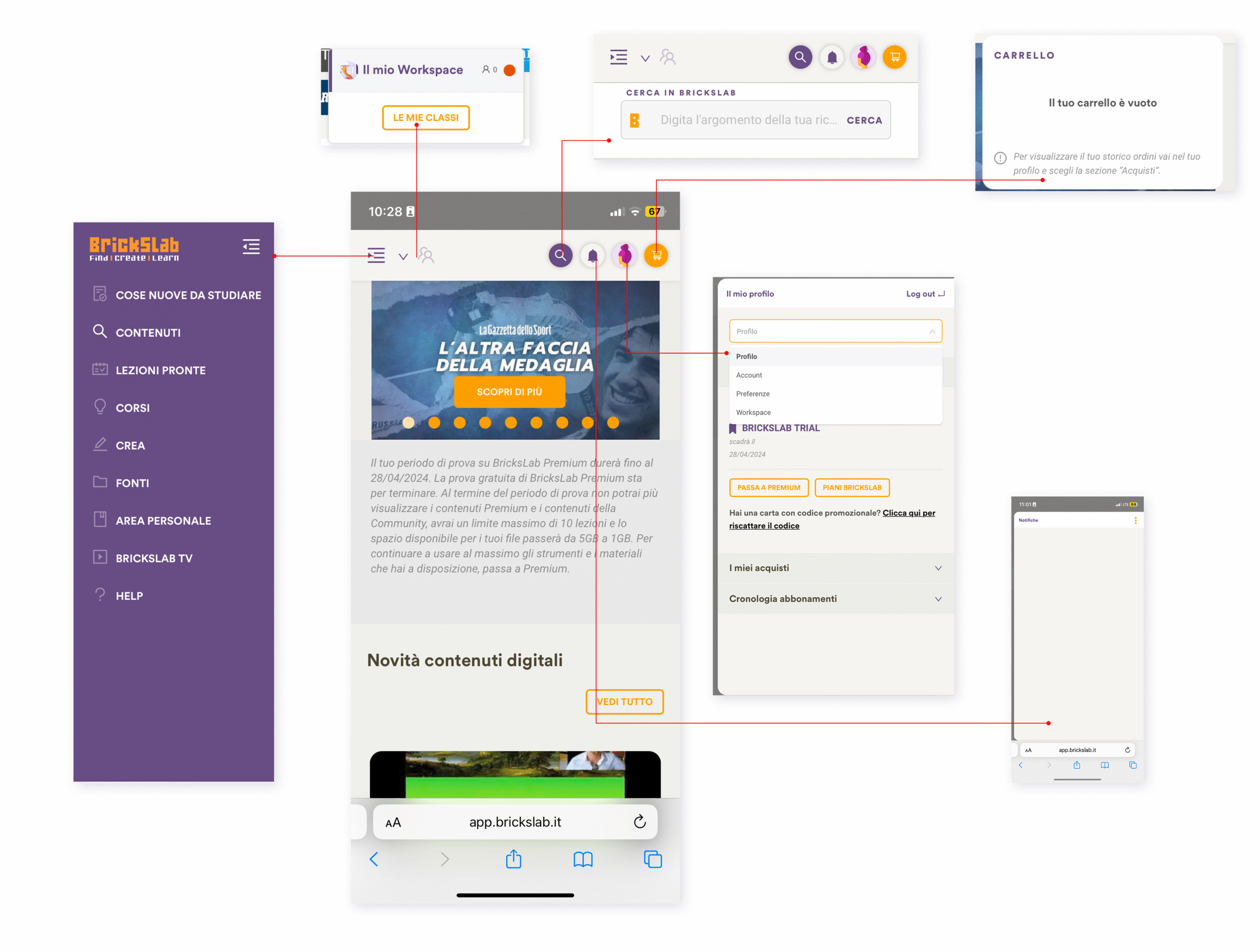
Basic preliminary visual audit regarding their homepage
APPROACH
Rethinking the Experience
UX Audit & Core Flow Redesign
Audited the existing web app, which had grown without a cohesive structure.
Identified that the search engine, their most valuable feature, was underused and hard to find.
Proposed a new mobile-first IA, making search the central entry point.
Simplified navigation and clarified the platform’s core value from the first screen.
Aligned the redesign with quick, task-focused mobile behaviors to improve usability and clarity.
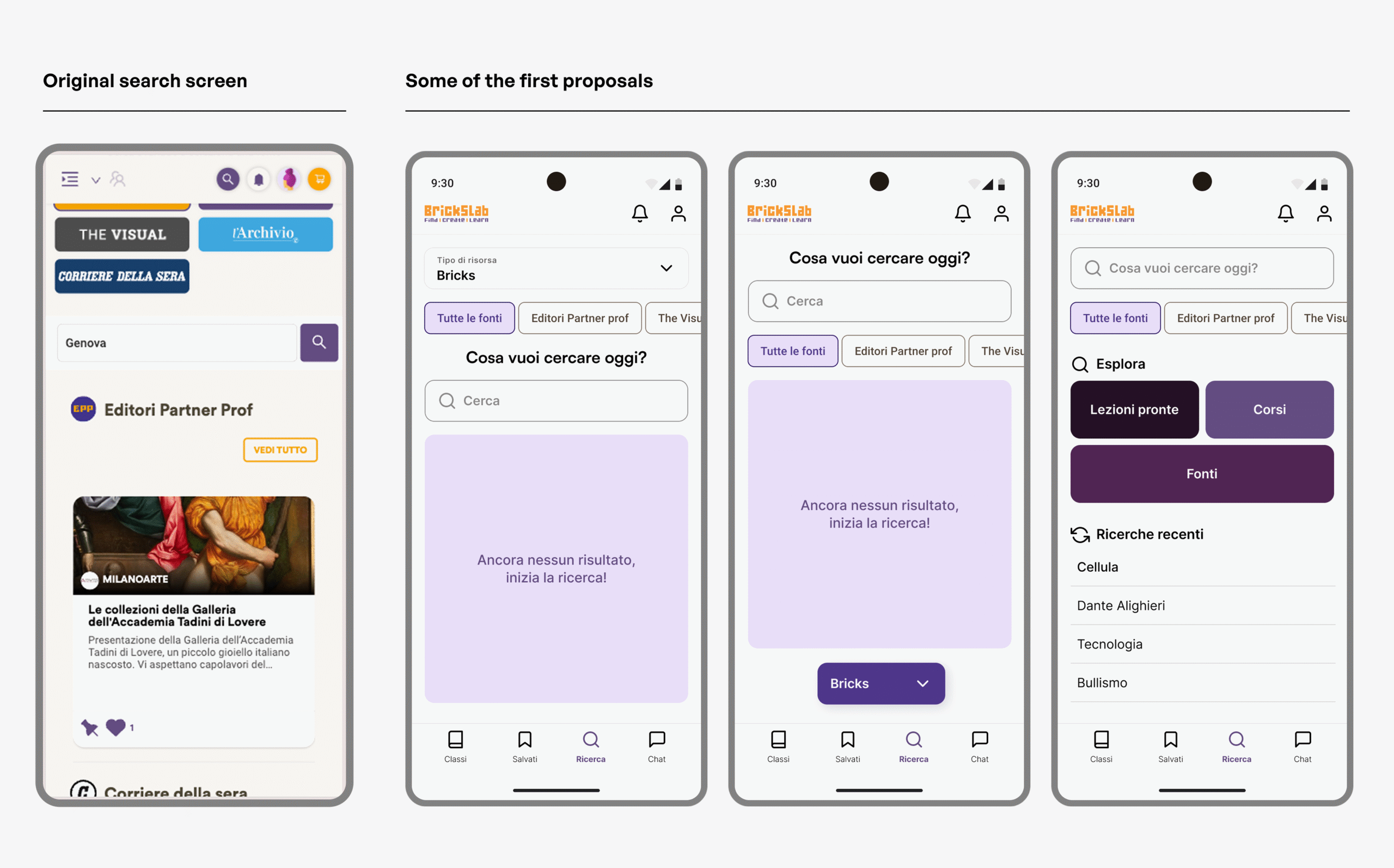
BEFORE
AFTER
BEFORE
AFTER
Lean Discovery via Client Collaboration
With no formal research budget, I collaborated closely with the internal team behind the original web app.
Collected insights on real user behavior, feature usage, and friction points directly from their experience.
Prioritized the following user journeys:
Finding content via a holistic and powerful search engine
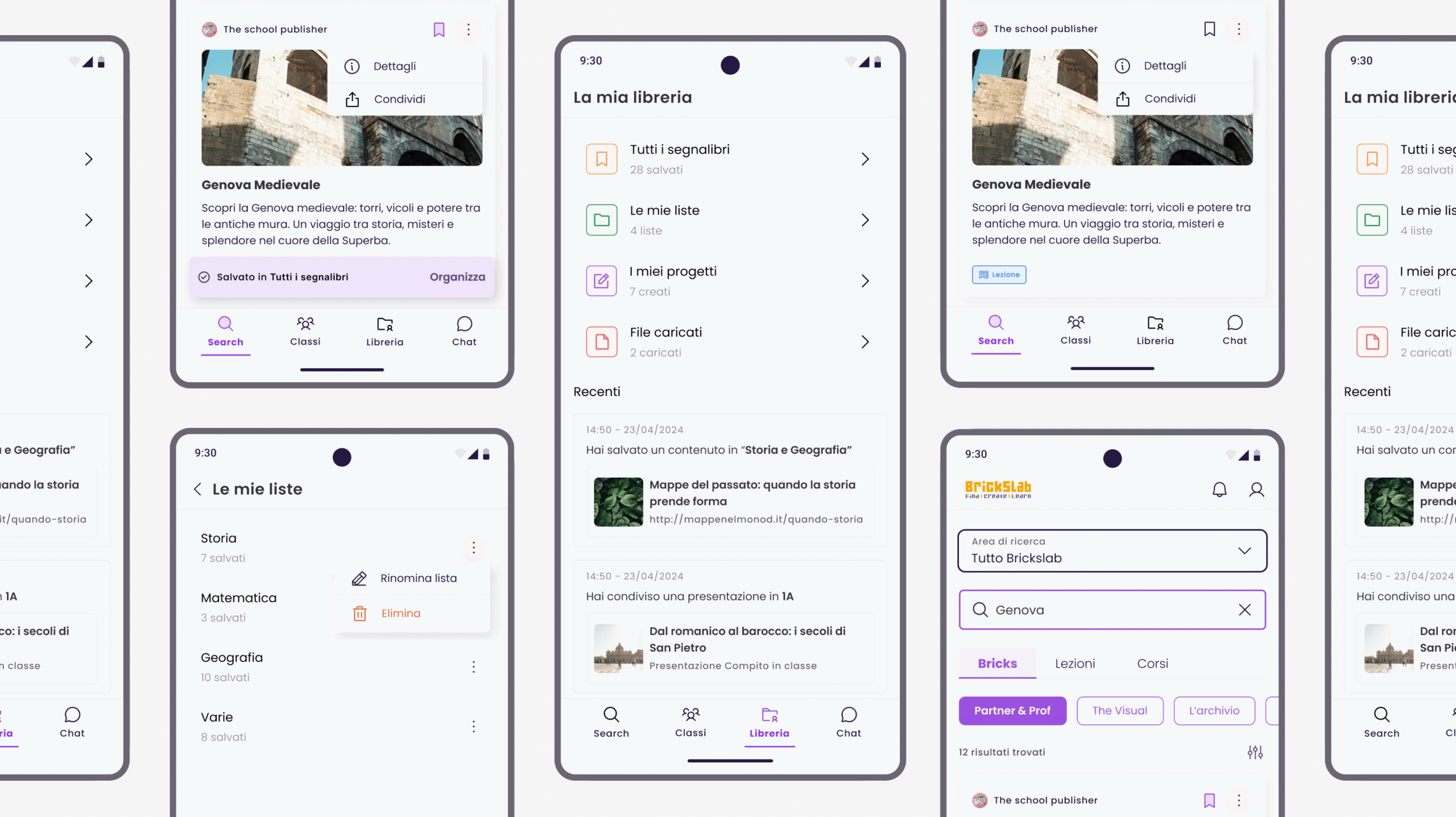
Accessing and consuming educational content across media types
Streaming via Google Classroom API for seamless classroom integration
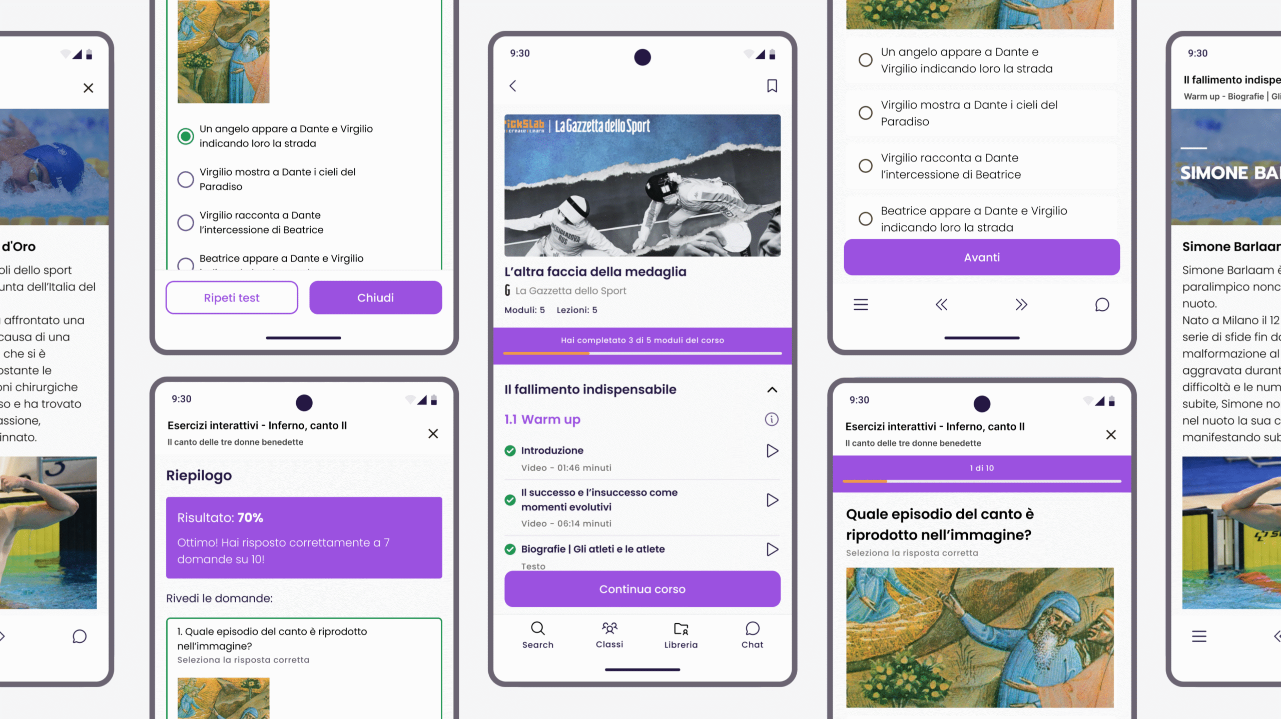
Using tests and interactive content effectively within the app
Ensured these flows were central to the native app design to match real-world needs.
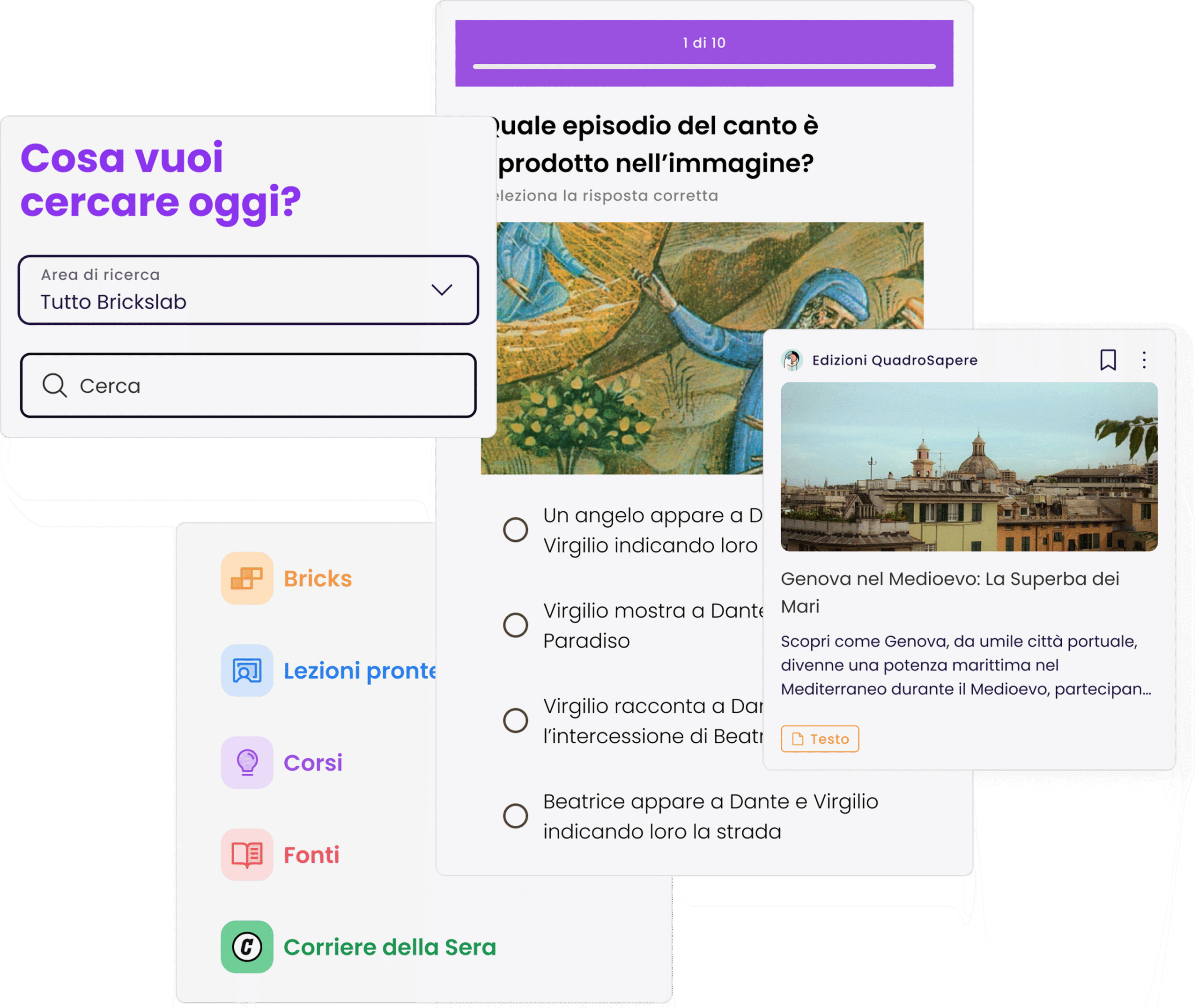
First ideas and proposal rethinking the search page
Feature Prioritization for MVP
Given the tight timeline, we couldn’t afford to redesign every feature. I worked closely with stakeholders to:
Streamline the overall experience to focus on the most essential and valuable tasks for users. By making these prioritization decisions, we could deliver an app that was polished, functional, and easy to test with real users at the education fair.
Prioritize key features like content search, browsing lessons, and creating tests for the MVP.
Defer less critical features and non-mobile-friendly elements to future releases.
DESIGN FOCUS
Clarity, Consistency, and Accessibility
Style-Agnostic by Intent
The client’s brand guidelines were flexible, so I focused on universal design best practices to enhance clarity and usability. My goal wasn’t to lock the app into a specific visual style, but to create a clean, adaptable design that could evolve over time.
Visual consistency: Fixed issues with iconography, color usage, and button styling across screens.
Improved hierarchy: Employed layout grids, spacing, and typography to make content more digestible and usable.
Universal UI patterns: Ensured the app felt native to iOS and Android by following OS guidelines and best practices, ensuring familiarity for users. These design decisions helped make the app usable on a variety of devices while allowing for future updates to the brand’s visual identity.
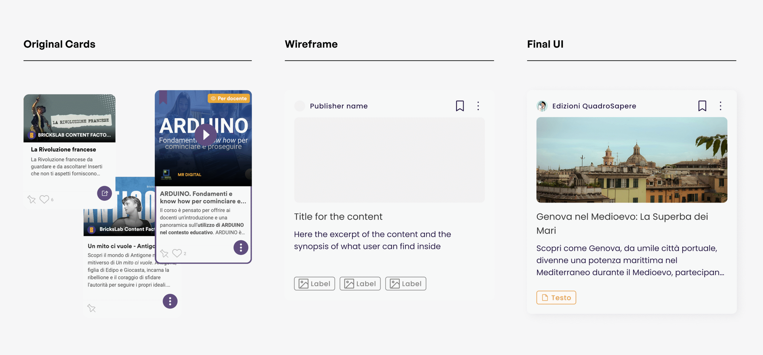
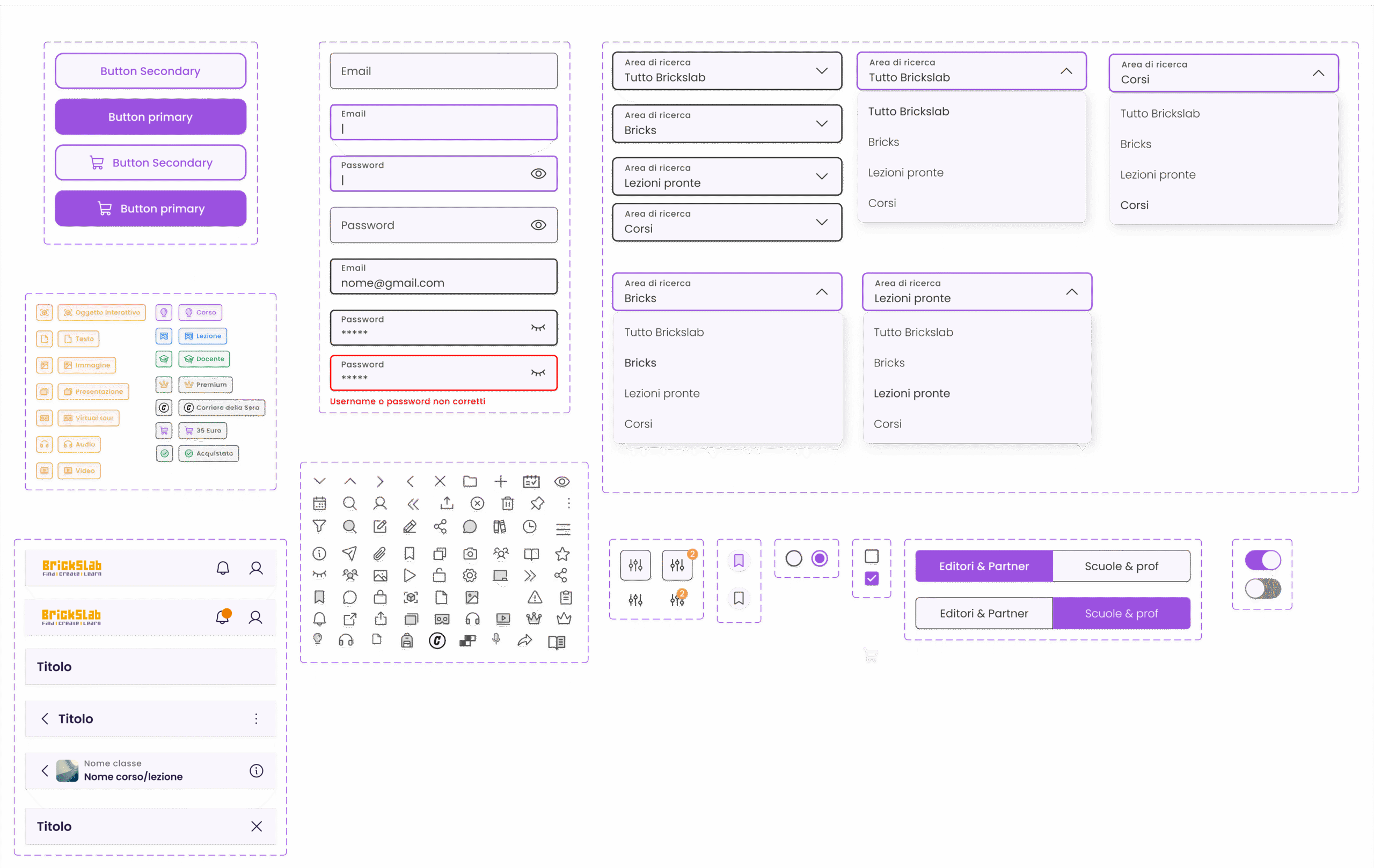
The redesign of the cards – From inconsistency to standardization
Accessibility by Design
Although accessibility wasn’t a formal requirement, I made sure the app adhered to best practices in design to ensure broad usability:
Contrast: Ensured proper contrast ratios for readability, especially for users with visual impairments.
Touch targets: Increased tap targets for mobile devices to make interaction easier and prevent errors.
Responsive typography: Used font scaling and spacing to accommodate different screen sizes and user preferences.
These considerations helped make the app more inclusive for a wider audience, including students with different needs and tech-savviness.
A small part of the UI kit foundation for a larger design system on Figma
COLLABORATION AND EXECUTION
Designing for Success
Led the project solo, with support from a junior designer during core phases.
Set up a lean Figma design system and UI kit to speed up delivery and maintain consistency.
Mentored the junior designer in strategic thinking and systematic design, helping her grow confidence and skills.
Used interactive prototypes and clear documentation to streamline dev handoff and reduce back-and-forth.
Maintained close alignment with internal teams to ensure smooth implementation.
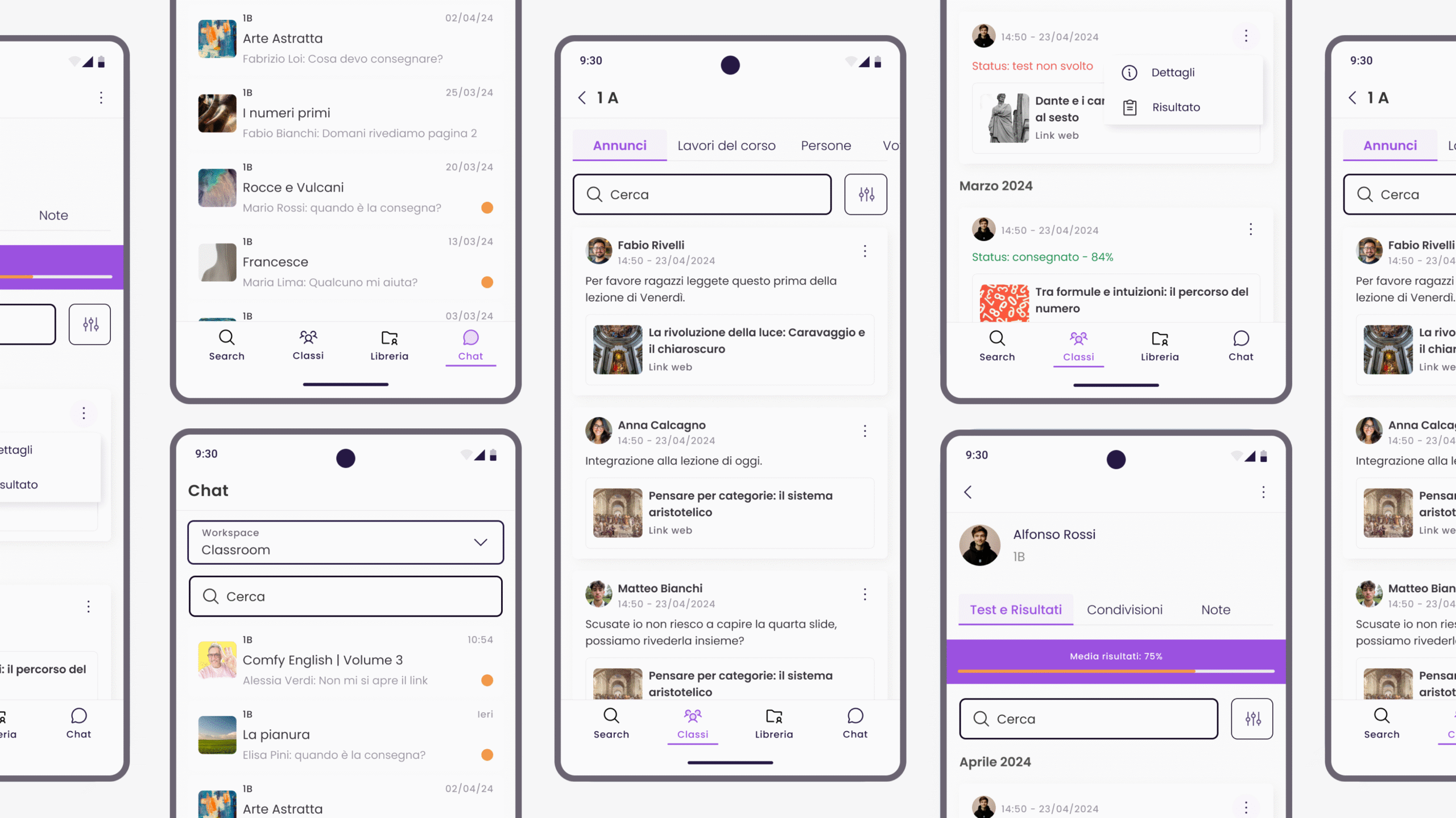
Final screens – Search EngineFinal screens – Test and various interactive contentsFinal screens – Library and BookmarksFinal Screens – Chat and Classrooms
RESULTS
A Successful Launch
The app launched on time, in sync with the education fair deadline.
Feedback from early users (teachers and students) was highly positive, particularly regarding the app’s improved accessibility and streamlined content discovery.
The redesigned search experience helped users find lessons and content more quickly and with fewer taps compared to the original web version.
Internal stakeholders reported a clearer understanding of BricksLab’s value proposition after the redesign, noting that the app felt more approachable and easier to use.
The updated visual system laid a solid foundation for future UI enhancements and brand consistency.
REFLECTIONS
Key Takeaways
Smart design decisions can replace formal research: When budget and time constraints are tight, leveraging internal knowledge and focusing on key pain points allows you to make impactful design changes.
Simplicity over complexity: Sometimes less is more. By prioritizing content access and core features, I ensured the mobile app was functional, intuitive, and easy to navigate.
Universal best practices: A style-agnostic approach helps create a foundation that works across devices while remaining adaptable to future visual or branding changes.
Accessibility is non-negotiable: Designing for inclusivity and universal access is crucial, even when it’s not a formal requirement — it benefits both the users and the product’s longevity.